Category Archives: Designers

Carrie Taylor, Bowling Green Modiste

Besides presenting my own paper at the Southeastern Region Costume Society of America Symposium, I learned a lot from the other presenters and from the museum exhibitions at the Kentucky Museum where the symposium was held. Much of the content of the first day of the symposium was centered around some artifacts in the museum’s collection – clothing made by the dressmaking business of Mrs. A.H. (Carrie) Taylor. Located in Bowling Green, Kentucky, Mrs. Taylor’s was THE fashionable dressmaking establishment in town. In fact, it had clients from not only southwestern Kentucky, but also around the country.

So much of fashion history has been written through the famous designers. If you think of nineteenth century design, Monsieur Worth of Paris comes to mind. But by the 1870s when Carrie opened her business, fashion was still more of a local thing, with the town’s dressmakers reigning supreme. Not that Paris wasn’t important, it was. But fashion magazines and sewing patterns made it possible for women around the country to feel fashionable. This was especially true in a place like Bowling Green where the favored dressmaker, Mrs. Taylor, traveled yearly to Paris and to New York to see the latest styles and to purchase the latest fabrics and trims.

Carrie Burnam was born in Bowling Green in 1855. She attended the local college, and in 1878 after graduation opened a dressmaking business in her parent’s home. Even after she married and had children, the now Mrs. Taylor continued to work, expanding her business along with husband Aaron, to where at its height, they employed 300 women workers. Mrs. Taylor directed the business, advising her clients on the styles, colors, and trims for their new dresses. Trousseaux were a specialty.

The Kentucky Museum holds several Carrie Taylor garments. Interest in her work dates back to at least 1980 when Western Kentucky University professor Sallye Clark wrote and published a study of Mrs. Taylor in Dress, the journal of the Costume Society of America. Several years ago I heard an updated report on Mrs. Taylor written by WKU professor Carrie Cox at a Charlotte, NC symposium. Dr. Cox’s interest led to the Taylor garments in the Kentucky Museum being conserved with the end result being the current exhibition of the Taylor clothing.

What made the experience so great was that not only did Dr. Cox talk about the importance of Mrs. Taylor’s work, we also heard from the conservator, Colleen Callahan, who did a presentation on the work she performed in order to stabilize the garments and to make them safe for display. She had photos of the before, during, and after of the conservation process. And the icing on the cake was that Ms. Callahan was available in the exhibition, pointing out the conservation. It was an enlightening experience to see a gown go from shredded silk to display on a dressform.

This lovely silk gown was in sad condition. The bodice was very shattered, with the sleeves being thoroughly tattered. Colleen removed the off-white insets and replaced them with matching silk. Here was where having an extensive stash of old fabrics came in handy. The patterned silk was also splitting so conservation netting was used to encase the fabric, preventing any further fabric loss. The dress had been made with large facings so some of the fabric from them was used to fill in larger spaces that were missing fabric.

The skirt was in better condition, but there are a few spaces where action had to be taken. What is really amazing is that unless one knew where to look, the conservation would have totally escaped notice.

This stunning blue silk dress looks pristine at first look, but Colleen worked hours to stabilize the fabric, to rework the caps of the sleeves, and to replace shattered places with matching fabric. Fortunately, when the dress was donated to the museum it came with a length of the original fabric.

Look carefully to see the conservation net. The sequined trim was probably bought already made, and was simply applied to the dress.

Best sleeves ever.

Glass cases can be annoying to people like me who want to take good photos to share, but having these encased meant that the visitors could see the dresses from every angle, and could get close up without risking touching the fragile textiles.

Not all the clothing in the exhibition required extensive conservation. These two evening coats are in fairly good condition with just some treated holes on the white, and some adjustments made for a missing lining on the orange.

The white coat was worn by and donated to the museum by Nelle Travelstead. Nelle attended nearby Potter College and when it came time to plan her trousseau for her 1906 wedding, of course she turned to Mrs. Taylor.

There were other garments on display, including two bodices, a 1910s dress, and some undergarments. All were finely made. The Kentucky Museum is always looking for Carrie Taylor garments and paper items from the business. The label reads “Mrs. A.H. Taylor, Bowling Green Kentucky.”

In 1905 the Taylor company published a short-lived magazine. There were only two issues published before bank problems formed them out of the magazine business. As part of the exhibition, a facsimile of the Spring 1905 issue was available to visitors to look through.

The exhibition was greatly enhanced through the careful telling of Carrie Taylor’s story. Many photos and quotes from Carrie and those who worked for her really brought her to life. And for those visitors not familiar with the styles of over a hundred years ago, there were explanations of what women wore in Carrie’s day. My thanks to the Kentucky Museum for hosting us, and congratulations on a beautiful exhibition!

6 Comments

Filed under Designers, Museums

Dogs and Brooke Cadwallader

I saw (and bought) a lot of great things on my recent trip to the Liberty Antiques Festival, but probably my favorite is this superb silk scarf by Brooke Cadwallader. Seriously, how can you beat a scarf with a map of the world peppered with our best friend throughout. I’ve written about Brooke Cadwallader in the past, so here’s a refresher course.

Brooke was an American who went to France in the interwar period. There he met his future wife, Mary Pearsall, an Italian/American who was working at Maison Tilly, a scarf maker. They joined forces and began their own scarf business, where they attracted the attention of designers such as Schiaparelli and Molyneux. Success led them to marriage. Unfortunately, the Nazis arrived in Paris, and the Cadwalladers were forced to flee. They ended up in New York, where they restarted their textile printing business.

They were again successful, and produced scarves and also fabrics they sold to designers like Tina Leser and Nettie Rosenstein. The New York operation was small, but in 1950 they moved to Mexico where the business expanded as Casa de los Gallos SA. The business operated until some time in the 1970s. Due to a crooked accountant and government bureaucracy, Cadwallader lost the business. Before turning over the factory, he burned all the textiles that were in stock, his silk screens, and many of the original designs. (Thanks so much to David Noyes, Cadwallader’s great nephew, for this great information.)

Brooke and Mary were fond of old prints, and you can see how they incorporated an antique look into many of their designs.
Here’s the entire scarf. My photography does not give a clue as to how wonderful this is. Click the image for a larger view.
The design makes no attempt to place each dog near the country of origin. Instead, all the dogs are citizens of the world.

And here’s the signature to look for. These scarves are always winners.

6 Comments

Filed under Designers, Novelty Prints, Vintage Clothing

Currently Viewing and Reading – Halston

Netflix has a new bio-pic on the life of Halston, and I watched it so you don’t have to. Actually, you might want to watch it anyway, just make sure your expectations are appropriate. Let me explain.

Anyone who has ever watched a movie or program “based on” the life of a historical figure already knows that the truth is not the first matter of consideration. Probably the nuttiest example I can think of is the series of mini-films Karl Lagerfeld made on the life of Coco Chanel. These were, of course, long-play commercials meant to bolster the Chanel myth. The scenes were highly contrived.

In the same manner, I found Halston to be contrived, especially the first episode. We get a short look at Roy Halston Frowick’s miserable childhood, in which the Iowa farmboy is inspired by a handful of chicken feathers to make his mother a hat to soothe her feelings after a violent confrontation with his father. This sets the stage for inspiration after inspiration, all highly contrived, in a Forrest Gump sort of way.

Raindrops on a ruined suede coat lead to Halston’s adoption of Utlrasuede (which the scrip insinuates Halston invented. Not so). A chance encounter with a mirror post-shower leads to Halston’s signature sweptback hair style. The inspirations are never-ending. Liza Minelli even tells Halston at one point that inspiration is going to find him. And so it does, and does, and does.

One advantage that bio-pics often have over documentaries is the ability to make the subject more human and relatable. But as Ed Austin, Halston’s longtime boyfriend said, after years of being with Halston he didn’t know him. The same can be said for the viewers of this mini-series. Three hours later, and I had no sense of who Halston actually was, beyond a lot of drugs and sex and temper tantrums. I found Ewan MacGregor’s portrayal of Halston to be unsympathetic, and that’s a shame. Several years ago I attended a talk by his niece Leslie Frowick who showed him to be a caring and thoughtful uncle. One dimensional characters always look shallow.

So I did what any inquiring mind does. I reread a book, in this case the book on which the program was based, Simply Halston by Steven Gaines. Gaines had the advantage of writing his book soon after Halston’s death in 1990 so he was able to interview most of the major players in Halston’s life. He had actually met Halston, and had written a book on Studio 54.

Simply Halston is a sad story of a man who had everything he ever wanted, and yet had so little that made him happy. Heavy drug use along with unprotected sex in the time of HIV, combined with poor business decisions destroyed his talent, his ambition, his business, and ultimately, his life.

So why would anyone want to see this program? Watch it for the clothes and Elsa Peretti’s jewelry, both of which are glorious. Some of the garments in the show are vintage Halston, while others are careful reproductions. It’s a Seventies fashion fest!

4 Comments

Filed under Currently Reading, Currently Viewing, Designers, Viewpoint

Juli Lynne Charlot Update

It’s been my great privilege over the years to know Juli Lynne Charlot, the woman who came up with the idea of the poodle skirt, and who made some of the most whimsical skirts of the 1950s. I had not heard from Juli Lynne in a while, so I was delighted to open my email inbox and find a message from her. Juli Lynne just turned 98, but she has been back at work on new skirt designs. This time she reintreprets the poodle skirt for 2020.

Juli Lynne sent along a press release to announce the skirts, and I’m going to use the words of the release to tell the story.

The full-circle felt skirt, created with the assistance of prominent Mexican artist Carmelina Encinas, depicts an orange poodle sporting President Trump’s unmistakable coiffure and dressed as a winsome waitress, serving up the U.S.A. on a silver platter to a smirking Vladimir Putin, stripped to the waist, seated on a prancing white horse, a lasso in his hand, ready to rope in the subservient canine. Big white letters spell out PUTIN’S POODLE. Two new designs are in progress: on one skirt The Leaning Tower of Pisa accompanies a similarly leaning profile of Our Dear Leader and the lettering reads “A VERY STABLE GENIUS…NOT”. Another skirt will show him in the infamous photo standing in front of a church and holding up not a bible, but a book entitled MEIN KAMPF (no further explanation necessary!).

This was not Charlot’s first venture into the political arena. In 1952 she was invited by a friend of presidential candidate “Ike” Eisenhower to design a skirt in her usual “conversation piece” mode, emblazoned with the words “I LIKE IKE”. This turned out to be a huge success and is said to have contributed to the landslide election of the popular general. For Eisenhower’s 1956 re-election campaign, Charlot designed another skirt, this time with a banner proclaiming “MORE THAN EVER, I LIKE IKE”. A sign in front of the White house reads “no vacancy”.

Then, she decided that it was time for her preferred party to have its say, and the result was an incredibly ingenious skirt entitled “GO TO BAT FOR THE DEMOCRATS”. It features a baseball-bat-wielding donkey and another donkey kicking the daylights out of a defeated elephant, and, in front of the White House, a moving van. The same designs were carried out in many other fashion items as well.

According to an article in Women’s Wear Daily, June 7, 1956, the “other fashion items” included aprons and men’s vests. The only example of these campaign items I have ever seen is the “I Like Ike” skirt. Wouldn’t having all these pieces be a fun collection for the lover of politics.

If anyone would like to reach out to Juli Lynne concerning her new skirt designs, or if any fashion writers or curators would like to be in contact with her, email me and I’ll pass your information along to her.

And please keep the comments civil.

22 Comments

Filed under Designers

Plain Jane by Danuta Overall Knickers

I don’t look for stuff from the 1970s, but when a really great piece crosses my path, I try to add it to my collection. Having lived through the decade, I have good memories of what was cool, but memories can be deceiving. I remember knickers, but in my mind I can’t really place the fad to a specific year or season. My guess is that they sort of came and went from the late 60s to the 80s. I need to do a deep dive into my 70s Seventeen magazine collection to get a better idea of that trend.

What I love about this garment is its strong nod to the sportswear of the past.  The late 60s and the 70s were influenced by a feeling of nostalgia, if you could call it that. For teens, it wasn’t a longing for our past, but instead, that of our parents and grandparents. We longed for the pop culture of the 20s, 30s, and 40s – without the Great Depression and the horrors of WWII, of course. No, we looked to Charlie Chaplin and Bogart, and Clara Bow and Betty Boop.

So where does my latest acquisition fit in? I’d say it’s part Little Rascals and part Rosie the Riveter.  The tweed fabric is a definite throwback to the knickers that boys, and increasingly, young women, wore in the 1920s. The bib shows the influence of overalls, which women wore for work and recreation in the 30s and into the war years. There might even be a bit of the  pilots’ jumpsuit in there.

But this is so typical of much of fashion and youth culture in the 70s. My mother, who was born in 1931, was always pointing out to me how the latest 70s fashions were so similar to what she wore as a young person.

The label is an interesting one. Plain Jane was the forerunner of Esprit. It was started in 1968 by Susie Tompkins and designer Jane Tise. They produced junior clothing under several labels including Sweet Baby Jane (a riff on the 1970 James Taylor album, perhaps).  The company was renamed Esprit de Corps sometime in the late 70s, and by 1980 the label had been changed to Esprit.

The story of the company is not a nice one, though they did make nice clothing. Susie Tompkins’ husband Doug was involved in a nasty union dispute starting in 1974, mainly because he wanted to break his contract with his workers and move production to Hong Kong. You can see who won by looking at the label.

Danuta was Danuta Ragent who designed Plain Jane from around 1973 to 1978.  Jane Tise continued to design the Sweet Baby Jane line, though her shares of the company were bought by the Tompkinses in 1976. My favorite sewing pattern of the late 70s was a Butterick Young Designer,  Jane Tise for Sweet Baby Jane . The design was straight out of the 1940s.

This is such a great design. I love how the line of the bib pockets extends to form the hip pockets.

All the buckles are metal and are adjustable.

Thanks to Robin for sharing the information about Danuta, and whose Etsy shop is one of my favorites.


18 Comments

Filed under Collecting, Designers, Sportswear

Tammis Keefe for Marlboro Shirts

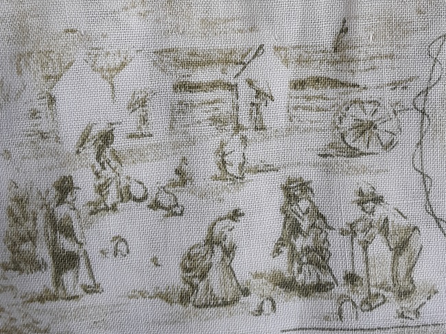
It may not be immediately obvious why I recently added this shirt to my collection. All will become clear when you see the closeup of the print.

If you have followed my writings for a while, you already know that I have a fondness for textile designs by Tammis Keefe. Today she is most remembered for her hankies and towels, but she also designed home decorator fabrics, and for a short time starting in 1957, she worked on textile design for the Marlboro Shirt Company.

If you are like me, the greatest association with Marlboro is with the cigarette brand. Marlboro Shirt Company was an entirely different company, though it does appear that at some point the company was acquired by Philip Morris, which also made the cigarettes. But my story dates to 1957 and 1958, long before that acquisition.

Marlboro Shirt Company had a long history, being formed in 1890. It was located in Baltimore, and for years men’s shirts were the only product. By the 1940s Marlboro had expanded into other men’s apparel, like bathing suits, pajamas, and jackets. In 1957 they entered the women’s shirt market with a new brand, Lady Marlboro.

At the same time, it was decided that the traditional man’s shirt could be made in sports styles, or rather, leisure styles to fit the increasingly casual American lifestyle. Tammis Keefe was brought in to design textiles that would fit into a more casual style. According to a paper written by FIT graduate student Suzanne Chee in 1990, many of the prints were (like mine) conversational in nature. She adapted antique motifs like vintage theater playbills and antique playing cards.  And the shirts were made for men and women in matching prints.

To me, the designs do not look as though they were actually drawn by Tammis Keefe. The style of the ones I have seen all have an antique print look. Or maybe I’m not giving Ms. Keefe enough credit. I’m sure she could draw in more than the midcentury style she is most known for.

The closeup views reveal why I had to have this one. There are tennis players…

picnickers…

hikers…

beach croquet…

and fishers.

I bought this even though it is badly faded. It must have been a favorite piece. The color is actually an olive green, but I can’t help but wonder if it was made in other colors as well. And if anyone has the matching man’s shirt, I’d love to add it to keep this one company.

5 Comments

Filed under Collecting, Designers, Sportswear, Summer Sports, Textiles

Tina Leser

Quite a few years ago I wrote this profile on designer Tina Leser for my now inactive website. I thought I had shared it here, but a search for it turned up empty. I’ve been showing some of myLeser pieces on Instagram, so this is a good time to share an updated version here as well. I apologize for the tiny pictures, and for the poor quality. These were taken years ago. I’ll be replacing them, hopefully soon.


A rarely seen photograph of Tina Leser, made in 1950. She appears to be wearing a dress of her own design. The photo was taken at her farm on Long Island, and she is seen here with her Great Dane, Taxi. Photo copyright and courtesy of Andrejs Sinats.

Tina was born Christina Buffington in 1910. She was later adopted and her name changed to Christina Wetherill Shillard-Smith. She was the daughter of an affluent Philadelphia stockbroker and his artist wife. The family traveled widely, and as a young child, Tina visited Asia, Europe and Africa, and for a time, lived in India. When it came time to choose a career, she settled on art school, and attended first the Pennsylvania Academy of Fine Arts, and then the Sorbonne, in Paris.

In 1931, at the age of 21, Tina married Curtin Leser, and the two of them moved to Honolulu, Hawaii. It was here that Tina Leser began her career in fashion. She opened a shop in 1935, in which she sold clothing that she designed. Leser used native Hawaiian, and imported filipino fabrics to construct sportswear, day wear and gowns. She then worked with a process to hand-block designs onto sailcloth. As an artist, she often handpainted a fabric to order. A customer might order a special skirt with the family pet hand painted on it.

Here is a great example of a 1940s Leser skirt. The fabric is a Guatemala woven design. Courtesy of listitcafe.com

In 1940, Tina Leser went to New York on a buying trip and to try and sell her designs. Partly through the influence of Harper’s Bazaar editor Carmel Snow, she placed an order with Saks for 500 garments.  She continued to live and work in Honolulu, but in 1941, decided to expand her business to New York. She closed her Honolulu store in 1942 after the bombing of Pearl Harbor, and moved to New York.  There she ran her company until the next year, when she became the designer at Edwin H. Foreman.  It was at Foreman that Tina Leser developed the international style for which she became famous.

It was wartime, and travel around the world was quite limited for the private citizen.  But Leser looked for, and found interesting cultural influences close to home – Mexico, Guatemala, Hawaii, and the USA countryside.  From Mexico she took the traditional appliqued flannel jackets and added sequins.  From Guatemala she took their handwoven cloth and made skirts and playsuits.  Their blanket fabric was turned into strapless dresses.

She utilized Hawaiian shapes – the sarong and the wrap skirt, and also used Hawaiian fabrics to make an innovative bathing suit that had just one strap.  And she referenced the United States by taking the coveralls adopted by so many American women factory workers, and making attractive versions in flannel and plaid.

photo courtesy of Lin Allen

In the postwar era, India was very much in the news, and in Tina Leser’s mind.  Having spent part of her childhood in that country, it was natural that India’s move toward independence would inspire her to base many of her designs on the country’s ethnic clothing.  She began the first of many designs based on the fabrics, colors and shapes of Indian traditional clothing. In 1947 she did a line of beachwear and sundresses made of traditional Indian madras plaid,

‘In the lines and colors of my beachwear,’ she said, ‘I try to capture the spirit of leisure and play in which it is worn. Successful design always reflects purpose…’

The Honeymoon collection was featured in the November, 1949 issue of Holiday magazine.

One of most remarkable events in Tina Leser’s career was her honeymoon, She was remarried in 1948 to James Howley (she and Leser had divorced in the late 1930s), and for their honeymoon the pair took a trip around the world.  Actually, it was an inspiration-finding expedition, and it led to her Fall 1949 multi-cultural collection.

The influences were gathered from what she would see on every step of her journey – kimonos from Japan, silk pajamas from China, a priest’s coat from Thailand, the colors and embroideries of Indian fabrics, peasant clothing from Italy, antique fashion plates from France and porcelains from England – all influenced her fall line.

In the photograph above, you can see how traditional Indian punjab pants were interpreted by Ms. Leser.  She continued to reinvent this basic ensemble throughout her career.

After 1949, Leser continued to reference a variety of ethnic influences, often mixing them in a single garment or collection. For example, she might take a purely American fabric such as the red and white check commonly used in picnic tablecloths, and sew it into an item with an Oriental-influenced shape such as a sarong or kimono.

Leser also liked to take a “casual” fabric and use it for a “formal” function. An example would be the same gingham tablecloth cotton sewn into a party dress. Or she might take a formal fabric and use it for a casual function, as in the case of her elaborately printed and embroidered bathing suits.

She also liked to take a favorite fabric or trim and use it across her collection. I’ve seen embroidery very similar to what is on this bathing suit made into a hostess gown, trimming the edges of a cashmere sweater, and made into a pair of slacks.

A great example is this wrap dress made from cotton sateen. It was featured in the May 1956 issue of Good Housekeeping, and earned their seal of approval.

But so that you don’t start thinking that all Tina Leser could design was exotic and foreign-inspired, she also used fabrics from some of the very best fabric design firms.  Most notably, she had designs using the “Modern Master” series of fabric from Fuller. This was a series of fabrics commissioned by Fuller Fabrics by some of the world’s most prominent artists, such as Picasso and Miro.  She also used Wesley Simpson prints, Hope Skillman fabrics and Boussac florals. And she loved and used cashmere, both from the American firm Dalton, and the Scottish Pringle.

She designed lots of pretty dresses that today, would be considered to be quite dressy, but in the late 1940s and into the 1950s, were much more casual than what most people were accustomed to wearing.

Tina Leser left Foreman in 1953 to form her own company, Tina Leser Originals. In the 1950s, women needed clothes for an increasingly casual lifestyle, and Leser’s pieces were casual but sophisticated.  People were entertaining at home, and many of Leser’s ads during the 1950s show a relaxed hostess curled up in a pair of her slacks and a comfortable tunic.

She perfected (some references say “invented”) the slim toreador pants of the 1950s, which were often paired with exotic tunics or cashmere sweaters trimmed with embroidered edgings. And in 1957 she showed a cashmere sweater that was dress length, bringing about the inception of the “sweater dress.”

She entered into a design arrangement with Gabar Swimsuits, and she designed for them for many years.  She’s often thought of as a swimsuit designer, mainly because her work for Gabar was so wide-reaching.

But it was not just the swimsuit she was designing – it was a whole new way of wearing it.  The cover-ups and skirts and matching shorts and wraps incorporated the design of the swimsuit beneath into a complete ensemble.  The bathing suit became the foundation for streetwear.

In 1964, Leser closed her business, only to open it again in 1966.  Her first collection after her re-opening was a tribute to India, with the fabrics being made on traditional Indian looms. She continued to make clothing that was oriental in feel, but she concentrated less on sportswear, and more on clothing was was adaptable to many situations, be it evening, day or at home.  Her fabrics were still very much inspired by her travels.

Tina Leser Originals remained open until 1982. Leser died four years later in 1986.

April Calahan, “Tina Leser: Global Vision”, The Hidden History of American Fashion, 2018

Chambers, Bernice G., Fashion Fundamentals. New York: Prentice-Hall, Inc., 1947.

Lambert, Eleanor, World of Fashion. New York: R.R.Bowker Company, 1976.

McDowell, Colin, McDowell’s Directory of Twentieth Century Fashion. Englewood Cliffs, NJ: Prentice Hall, Inc., 1985.

Stegemeyer, Anne, Who’s Who in Fashion. New York: Fairchild Publications, 1980, 1988.

10 Comments

Filed under Designers